Showing posts with label Loriann Signori. Show all posts

Monday, March 21, 2011

Somerset Paper experimentation

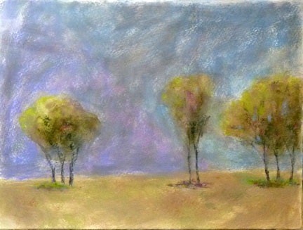
pastel rubbed in for underpainting with pastel on top

pastel brushed with Turpenoid under pastel painting
Today I experimented with Somerset paper. I did four paintings, using different techniques to see what I thought about this pastel surface.

Per Loriann Signori's suggestion, I tried using a light pastel application washed over with Turpenoid for my under painting and then added more pastel on top. I liked the melting effect of the pastel into the paper, but the Turpenoid dried or absorbed so quickly into the paper, I did not achieve any washy, watery movement of color. Judging from the white paper showing through, I may have not applied enough pastel with my under painting to get the full effect of this technique. I will try it again.
Somerset is a hardy paper and seemed to handle my scrubbing and rubbing on it, as I did in the example at the top of this post. I did not observe any felting of the paper and I was able to put on many pastel layers (8 or more in some places). 

My least successful experiment involved a light pastel application washed with rubbing alcohol. I had a lot of warping and buckling of the paper from the alcohol and that made the dry pastel application later much more difficult to control. 

A good day for experimenting. I have some Twinrocker paper waiting some experiments next time!

Thursday, February 10, 2011

All thumbs


My sketchbook is filled with words, sketches, notes from books, notes from classes and lectures, incidentals, ideas, feeling words, starts of poems, and thumbnails.

I've been following blogger Barbara Newton and her exploration and use of thumbnails as a part of her painting process. You can read about her thumbs here.

Loriann Signori
uses thumbnails regularly, but lately in a new way as she explores memory work. See her thumbs here.

I like the brevity of thumbnails. By necessity they have just enough information about the shapes and value to give a good idea about what's going on in a scene. In my thumbnails above, I have done many of them from life, but several of them from photographs. Photos can lead me astray with all of their precise information, but I'm beginning to try on the idea that I can reduce a photo to a thumbnail and then paint from my thumbnail to become a more expressive and painterly painter. We'll see.

Ideas are like shoes. Until you try them on and walk around in them for a bit, you don't know if you should buy them and take them home.

Do you use thumbnail sketches?

Wednesday, October 13, 2010

Thick and thanks

8 x 8
oil on BFK

10 x 8
oil on BFK

Thank you for commenting on the post from yesterday! I appreciate your encouragement and feedback, Celeste, Sam, and Loriann ! (Thanks to Gregory, too, for his Facebook comments!)

I have been trash talking my new oil paintings and that's not productive and smells a bit of behaviors I don't find attractive, so I will stop. Right now. Thanks for calling me on it!


Today I took stock of what I've painted so far. I wrote little critiques of each piece (which I will share with my teacher at our next session) and found something good to say about them. Of course, I had many criticisms, too. A common criticism was the miserly amount of paint I applied. Today I determined to lay it on thick!


On the top you see my return to fruit. The beautiful pear, lit from below. I wanted to play with the complementary color and leave big globs of paint untouched. The pear is floating and that's a problem I created with the odd lighting, but I still kind of like it.


Next, I tried a painting using only palette knife. It was like frosting a waterfall cake! Oil is fun and I will remember to apply it more liberally in my next paintings.

Sunday, November 15, 2009

Extreme format

I really enjoy working in the 18 x 24 format. Somehow that 3:4 ratio rectangle makes sense to me. But, I am very attracted to paintings that are done in less expected formats.

On her blog, Loriann Signori posted an interesting demonstration and discussion on this very topic. I think you will enjoy looking at it, too. Click here.

So, I cut my 18 x 24 paper in half and came up with a 9 x 24 surface for this painting. I'm not sure that I like it, but I like the idea of it. It feels to me like a glimpse of something between the slats of a picket fence.

Done on hot press Arches with watercolor and pastel. Daisies are her favorite flower. I favor tulips. How about you?